

I have been a Stampin’ Up! demonstrator for so long that I find myself thinking in “Stampin’ Up!” language. I associate the colors that I see around me every day with their closest Stampin’ Up! counterpart. Last Sunday, I found myself telling my sister-in-law that I liked her “So Saffron” pants. Pacific Point is both “Duke” and “Barnard” blue to me. (I am so happy that my daughters’ colleges are the same colors. It helps my OCD. But that is a story for a different day.) As I type this, my daughter is wearing her new Smoky Slate t-shirt.
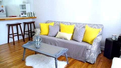
The inspiration for my latest card comes from my daughter’s apartment. I had the pleasure of helping her move in and decorate it last year. She started from scratch without any furniture; it was a wonderful blank canvas for me! The color scheme ended up being yellow, gray, and white.
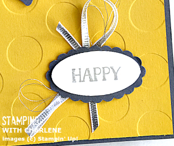
Luckily, I am not color-blind. However, when it comes to gray and silver, I sometimes have a difficult time distinguishing between the two!
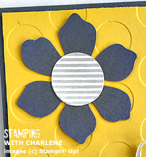
To create the striped center for the flower, I used the 1″ circle punch and the diagonally-striped stamp from the Six-Sided Sampler Stamp Set. And, yes, I know that I attached the Crushed Curry piece wrong-side-up! I wanted to go with the de-bossed look of the Polka Dot Textured Impressions Embossing Folder to change things up a bit. (and maybe I accidentally got some black ink on the other side. oops.)
Come back tomorrow for another color combo that was inspired by something I see every day. Plus, look at what starts tomorrow! Woooo!!!